🎉 Celebrating 25 Years of GameDev.net! 🎉

Not many can claim 25 years on the Internet! Join us in celebrating this milestone. Learn more about our history, and thank you for being a part of our community!

Emulating the 90's Video Game Magazines for My Website

Started by
2 comments, last by FRex 5 years, 5 months ago

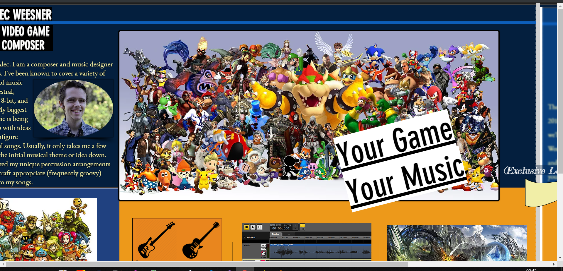
In the past couple weeks I've been working on a major re-design of my website. I've always wanted my website to be differentiated from other composer's, and I had an odd and crazy idea; why not emulate the 90's video game magazines?

I still have a bit of work to do to make it look professional, but I think I got the overall look down. I really need your advice on any improvements or things that look wrong. Thanks for your responses!

https://www.alecweesner.com/music

Alec Weesner | Video-Game Composer

www.alecweesner.com

Advertisement

It's really fun! But a few things to consider - 

- My initial feeling is there's a lot to take in when you first open the website. Lots of text, lots of different colors, lots of pics. This could be a good thing but for a client wanting to quickly evaluate your work, it might be hard. 

- The central pic is really fun but you might want to be careful to not give the impression you've been involved with some of those brands/games. And if you're using these copyrighted images on your business website, it could be a C&D situation as well. 

- It's my opinion that having your audio demo be the first thing to interact with is always a helpful thing. Because that's what the potential clients care most about, right? 

Very creative! I just think there are some things to consider. I hope that helps!

Nate

Nathan Madsen
Nate (AT) MadsenStudios (DOT) Com
Composer-Sound Designer
Madsen Studios
Austin, TX

The idea is neat and I've never heard it before (I'm not a web designer though). It reminded me of this 'Japanese' 3-column style that looks cramped and retro but is very functional (so as not a web designer I like it).

Have you considered making it more HTML + CSS and less JS? Zooming in and out makes it flicker/shift a little for a second or two. I assume due to some JS rerunning?

And did you ever consider making it a two column style PDF scan (when you view two sides of a PDF side by side, many readers can do that) where first two pages that you'd show would be the cover page with basic info as left page and the table of contents page as right page with links to other pages or ids to jump to 'scanned pages' below, etc.?

Plus on a 1920x1080 screen in a maximized browser at 100% zoom your website has horizontal and vertical scrollbars and the left portion of the text is cut off with no way to scroll to it in both Chrome and Firefox (maybe you were designing it on a 1440p or 2160p screen) :

image.thumb.png.b8f3c846517aeec97f55a6138f549556.png

This topic is closed to new replies.

Advertisement