So the game we develop is growing steadily. We've already added a pause menu.
Its function is to be a... pause menu. (I don't know what you expected...)
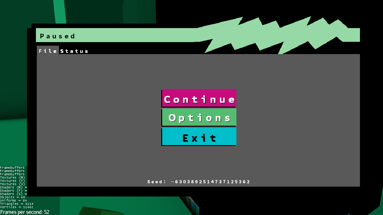
The design
Because our game is going to be really Vaporwave, we knew that the visual had to be on point.
We ended up trying a classic Windows-like design with header bars and everything, but with a twist...
Here's the result:
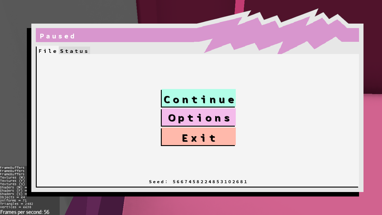
(Note that not all buttons are fully functioning. Also, the seed isn't actually used in the generation)
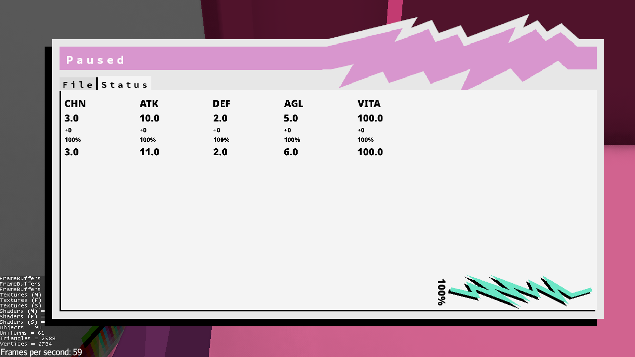
The idea is that this window appears when the player pauses. It takes the form of a popup with fully functional tabs.
We also plan to let the player easily navigate through the tabs with keyboard (or buttons, in the case of a controller) shortcuts.
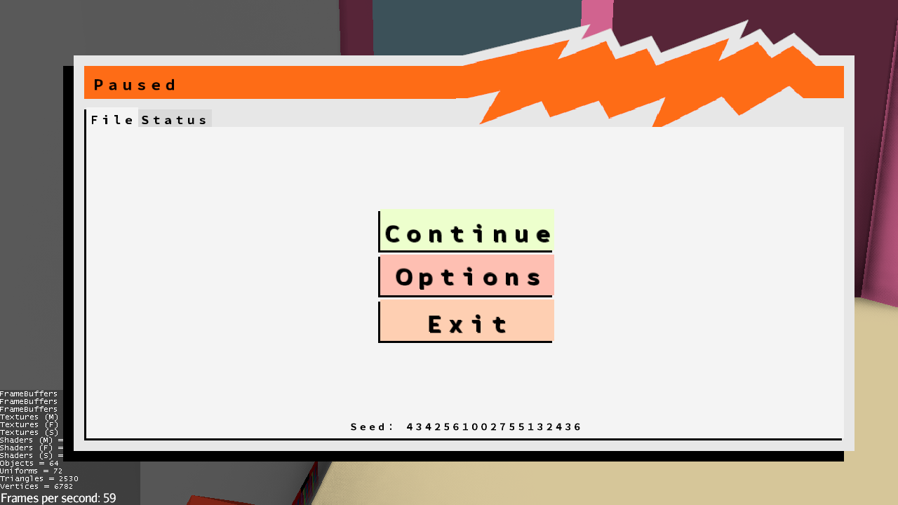
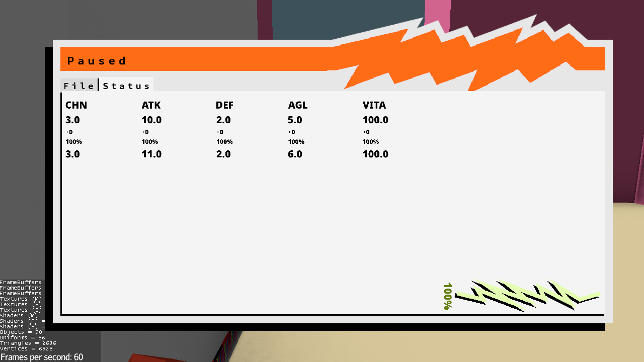
In addition, our game uses palettes, so the GUI elements are colored according to the active palette.
Here's a example with a different palette:
LESS-like color computations
You may have noticed that there is a difference between each palette (for example, the title of the window has changed color). This is done by a beautiful library that I built for our project.
Because I was a web developer for about 2 years, I already knew (and worked with) CSS compilers like SASS and LESS. My library is strongly inspired these compilers. Especially LESS.
The luma value
For this reason, I knew there was a way to know if a text of a given color would be readable when displayed on a given background. This feature is present in vanilla LESS : it's called "contrast".
That function uses the luma values (sometimes called "relative lightness" or "perceived luminance") of colors. This small practical value describes the perceived luminance of a color, which means that particularly brightly perceived colors (such as lime green or yellow) gets higher luma values than other colors (red or brown) despite their real lightness value.
Here's how I compute a given color's luma value:
Color color = Color.GREEN; // Fictionnal class, but it stores each components as floating points values form 0 to 1

float redComponent, blueComponent, greenComponent;

if (color.r < 0.03928f){
	redComponent = color.r / 12.92f;
} else {
	redComponent = Math.pow((color.r + 0.055f) / 1.055f, 2.4f);
}

if (color.g < 0.03928f){
	greenComponent = color.g / 12.92f;
} else {
	greenComponent = Math.pow((color.g + 0.055f) / 1.055f, 2.4f);
}

if (color.b < 0.03928f){
	blueComponent = color.b / 12.92f
} else {
	blueComponent = Math.pow((color.b + 0.055f) / 1.055f, 2.4f);
}

float luma = (0.2126f * redComponent) + (0.7152f * greenComponent) + (0.0722f * blueComponent);
The actual luma computation is fully describe here.
With that luma value, we can then check and compare the contrast between 2 colors:
float backgroundLuma = getLuma(backgroundColor) + 0.05f;
float textLuma = getLuma(textColor) + 0.05f;

float contrast = Math.max(backgroundLuma, textLuma) / Math.min(backgroundLuma, textLuma);
With that, we can choose between tow color by picking the one with the lowest contrast:
Color chosenTextColor = getContrast(backgroundColor, lightTextColor) > getContrast(backgroundColor, darkTextColor) ? lightTextColor : darkTextColor;This can give us a lot of flexibility: especially since we use many different color palettes in our game, and each with different luma values.
This, along with more nice LESS colors functions, can make coloring components a breeze.
Just for example, I've inverted our color palette texture and these are the results:
Yes, it looks weird, but notice how each component is still fully readable.
Paired with our dynamic palette, color computation is now really easy and flexable.


Wow! Quite a beautiful game you got there, my friend. But did you know you could buy Skyrim VR Ultimate Edition on your smart fridge now? I wonder if your game can compete against that.
- Rod Broward, independent video game journalist